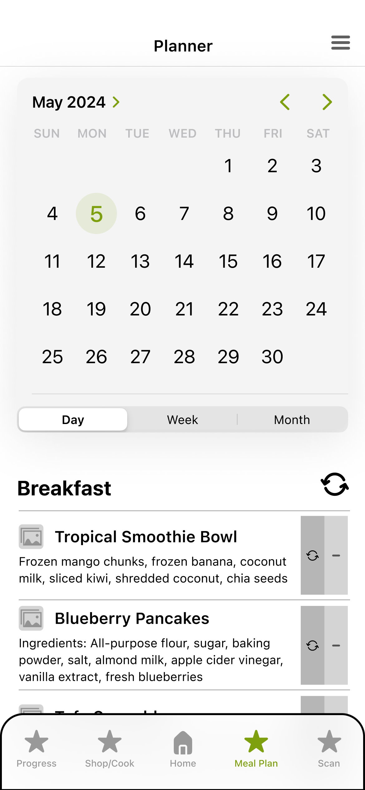
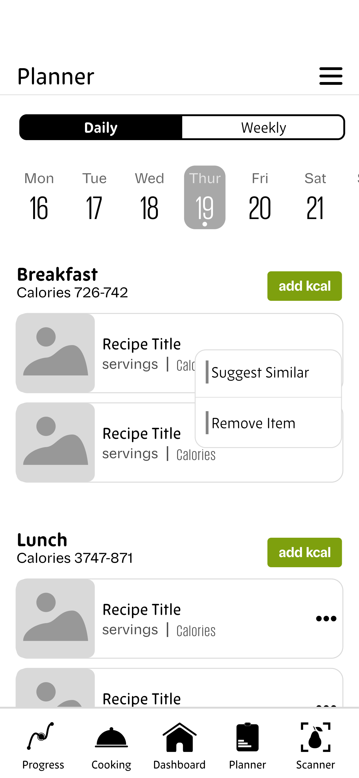
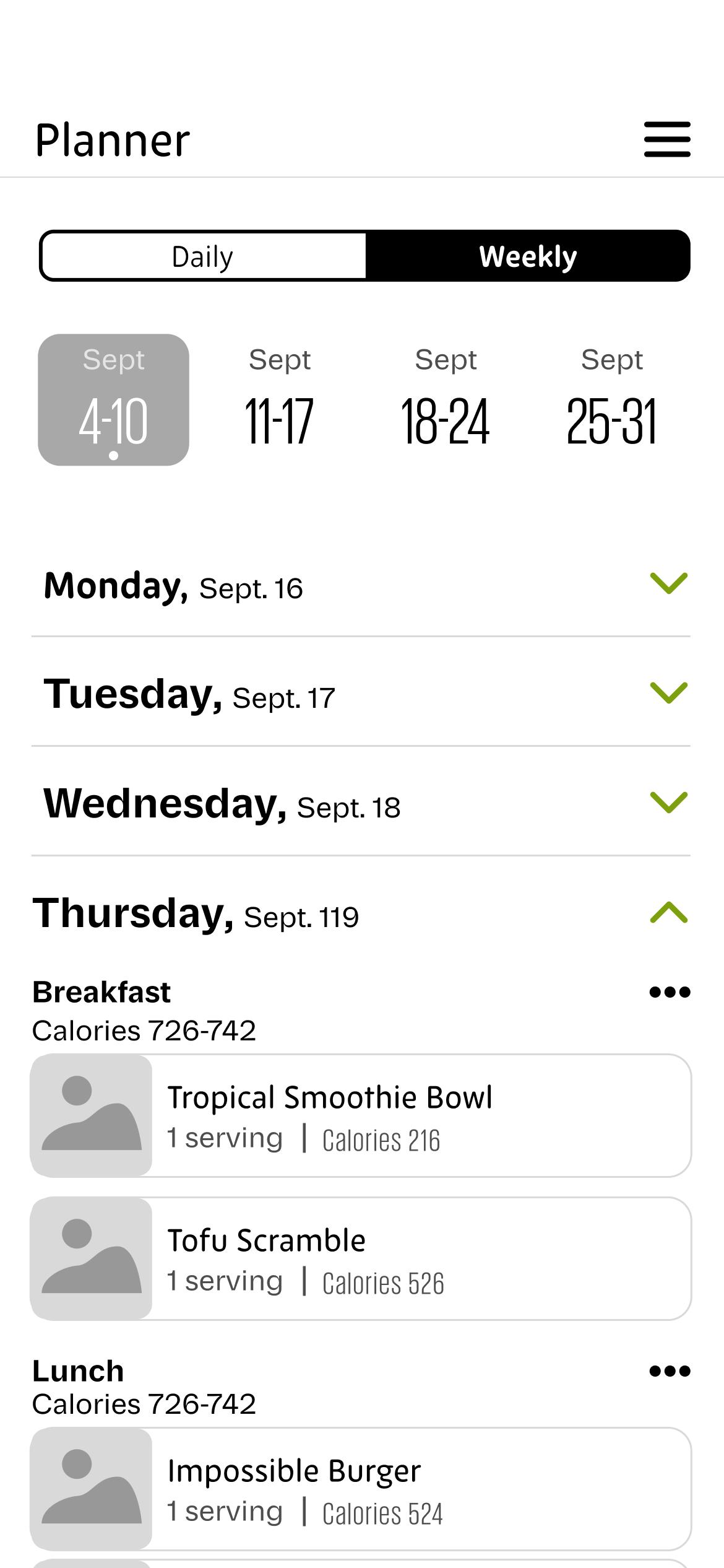
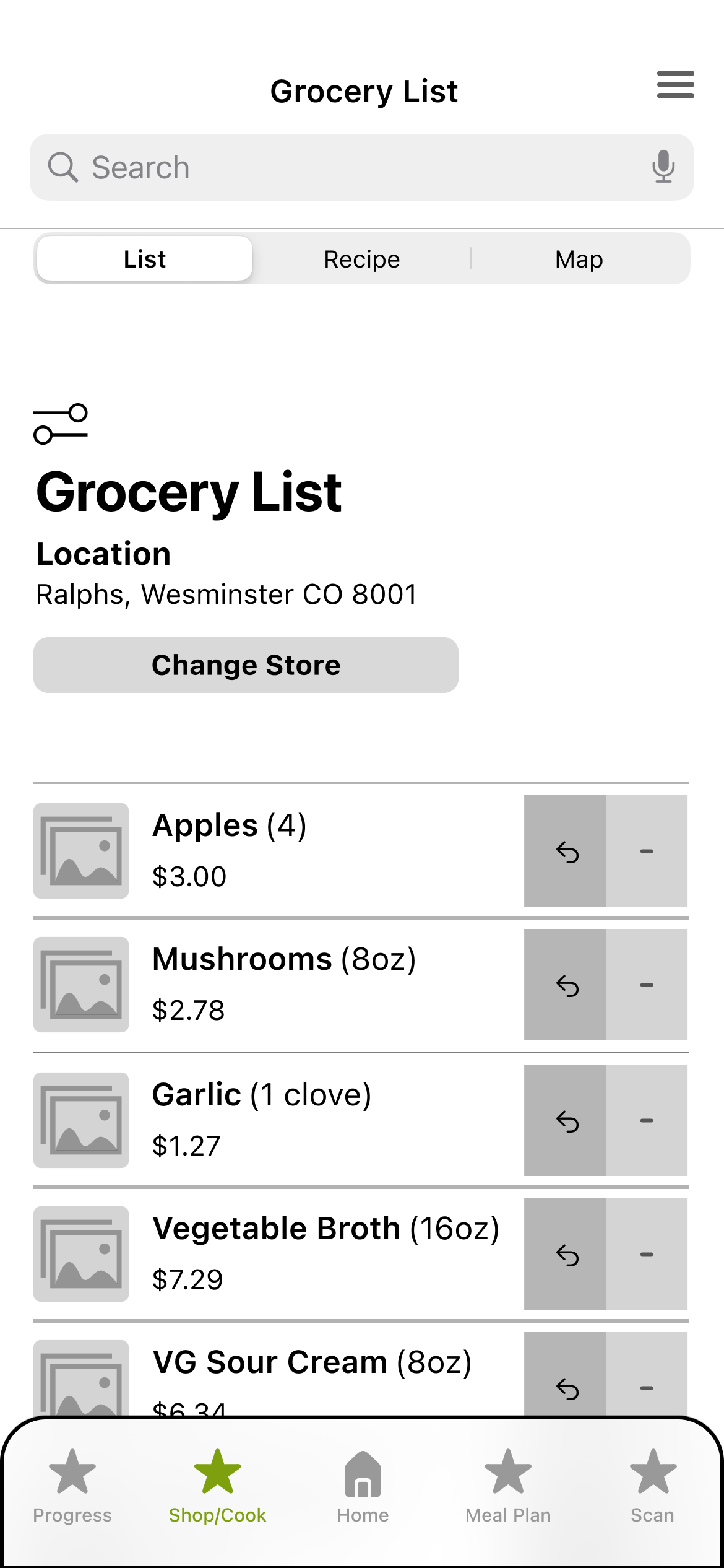
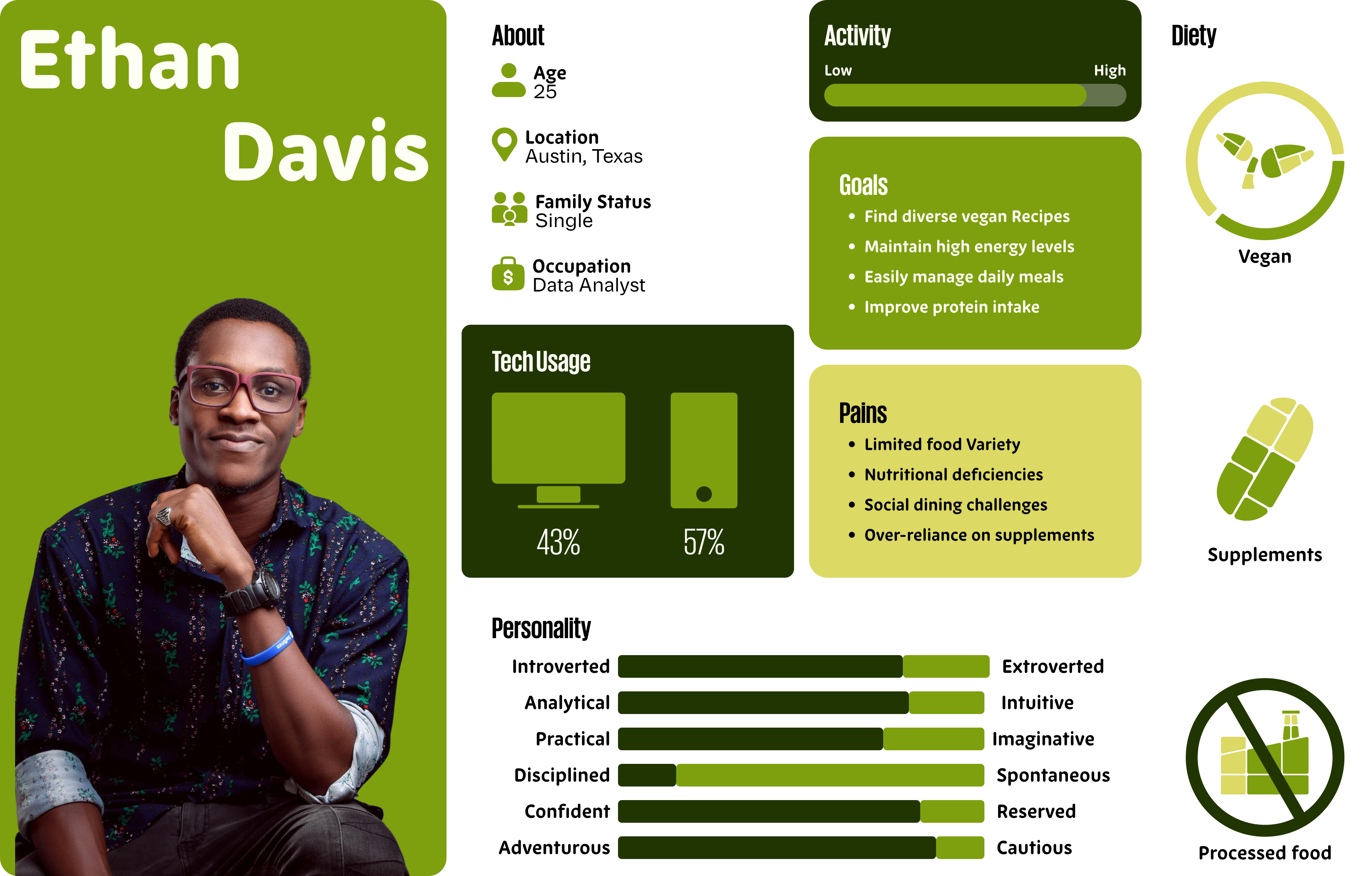
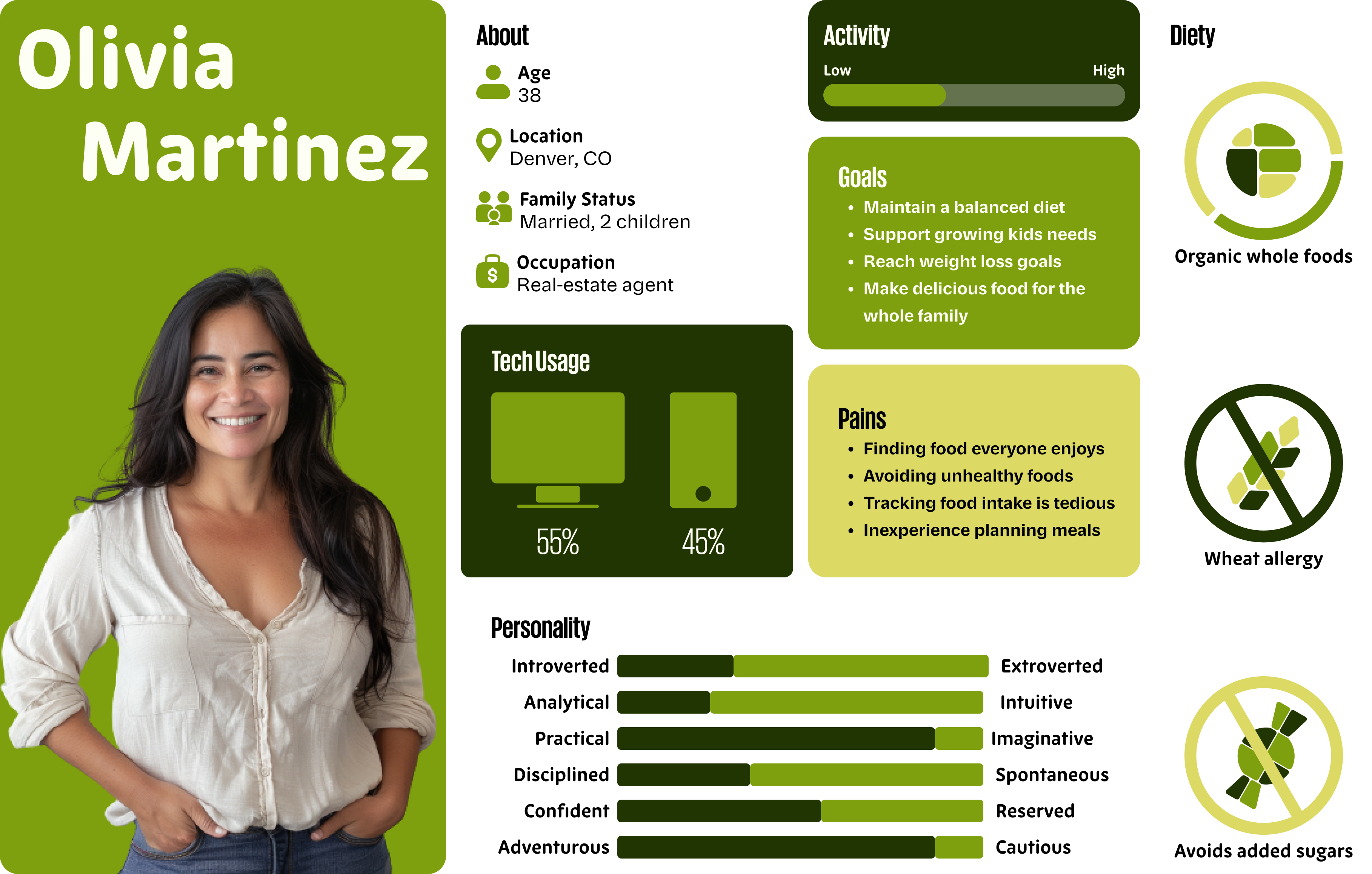
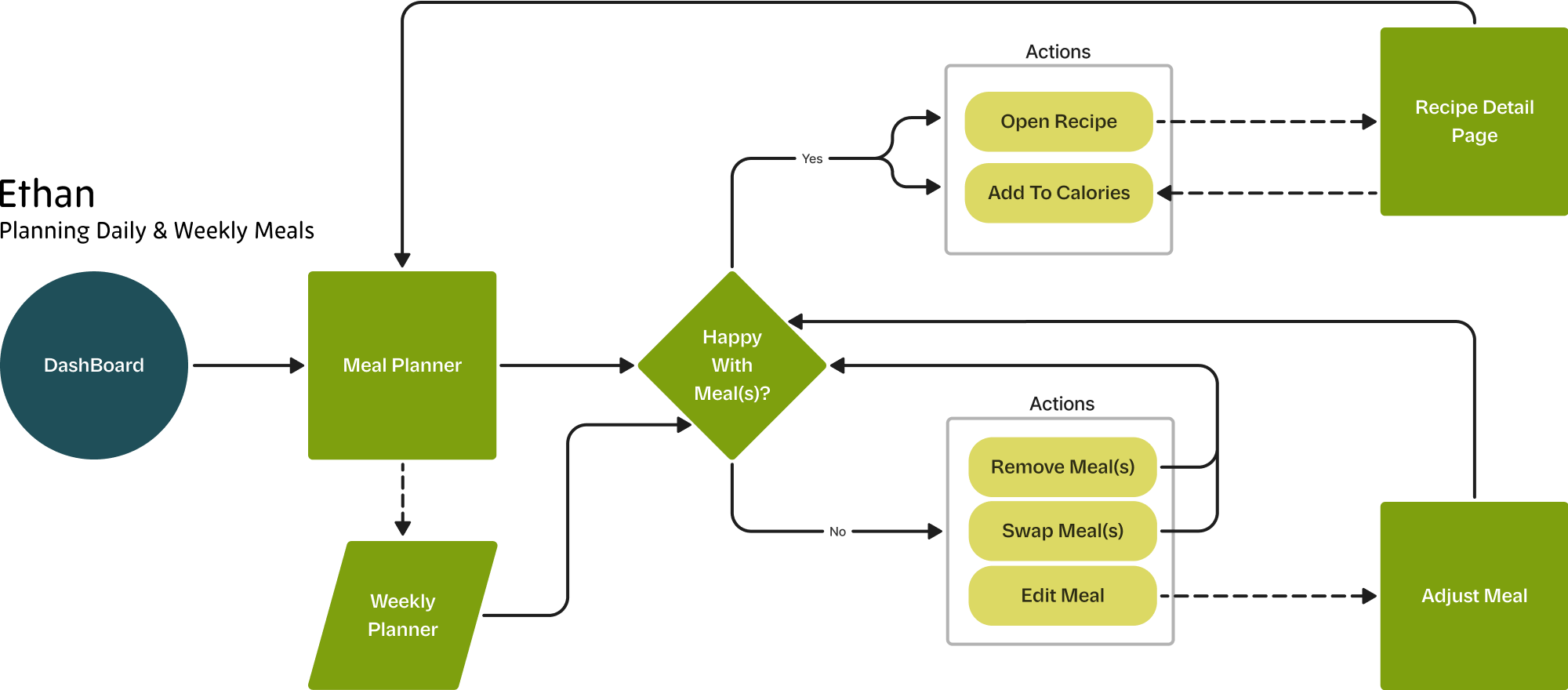
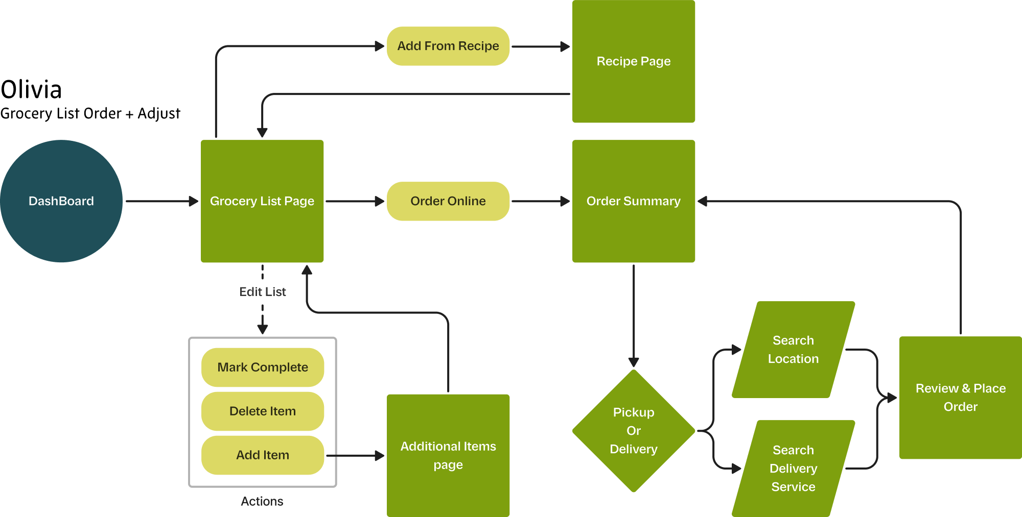
07

Meal.io

Nutrition

Artificial Intelligence

Class

Interaction Design II

Duration

12 weeks

Typefaces

New Zen, Parabolica, Giorgio

Deliverables

Brand identity, Website, Naming

Problem

Many individuals struggle with maintaining a healthy diet due to the complexities of meal planning, recipe discovery, and grocery shopping. Existing solutions often focus on either tracking nutrition or planning meals but fail to seamlessly integrate both, leaving users overwhelmed.

Solution

Meal.io simplifies the nutrition journey by combining personalized meal planning, intelligent recipe suggestions, and seamless grocery list creation in one user-friendly platform.

User Personas

After conducting user interviews, I developed targeted personas that revealed a common frustration across nutrition apps: the burden of manual input. To address this, Meal.io was designed with an autonomous, AI-driven system that reduces cognitive load and minimizes user interaction, streamlining the experience through predictive flows and intelligent defaults.

Userflows

User flows were created to better understand the varying needs and behaviors of individuals using the app. Each flow focuses on a distinct but critical aspect of the Meal.io experience, helping to plan for the complex interactions the app must support. These flows not only informed the layout and feature structure, but also highlighted the importance of adaptable interactions that can scale to different planning styles and preferences.

Version 1
Version 2
Meal Planner

Insight

Early wireframes helped define the app’s foundational structure, but user flows and interactions still felt fragmented. The complexity of switching between planning, grocery, and recipe tools revealed a need for stronger hierarchy, clearer navigation, and more personalized entry points.

Changes

The calendar was simplified for better scanability, while navigation and key actions were made more visible and accessible. Reducing excess descriptions clarified serving sizes and calories, resulting in a cleaner layout and smoother user flow.

Grocery List

Insight

Early wireframes helped define the app’s foundational structure, but user flows and interactions still felt fragmented. The complexity of switching between planning, grocery, and recipe tools revealed a need for stronger hierarchy, clearer navigation, and more personalized entry points.

Changes

The calendar was simplified for better scanability, while navigation and key actions were made more visible and accessible. Reducing excess descriptions clarified serving sizes and calories, resulting in a cleaner layout and smoother user flow.

Final Visual Identity

Meal.io’s visual identity blends clarity, warmth, and modernity—offering a softer alternative to the tech-heavy tone of typical nutrition apps. Green tones guide users through food-related tasks, while bright cyan adds a subtle tech layer for tracking and data. The friendly, modern typography reinforces this balance between approachability and intelligence.

Final Thoughts & Takeaways

Working on Meal.io pushed me to think beyond clean flows — it challenged me to design for nuance, unpredictability, and personal goals. Mapping the information architecture and user flows taught me the value of system-level thinking and the need to build flexibility without overwhelming the user. This project deepened my ability to prioritize complexity, and helped me create a user experience that adapts to people rather than asking them to adapt to it.

More Projects