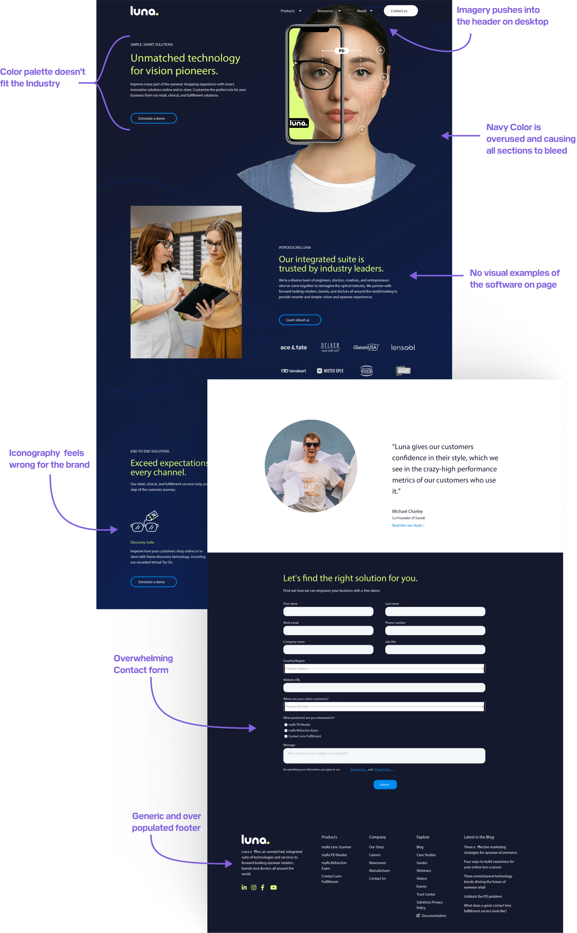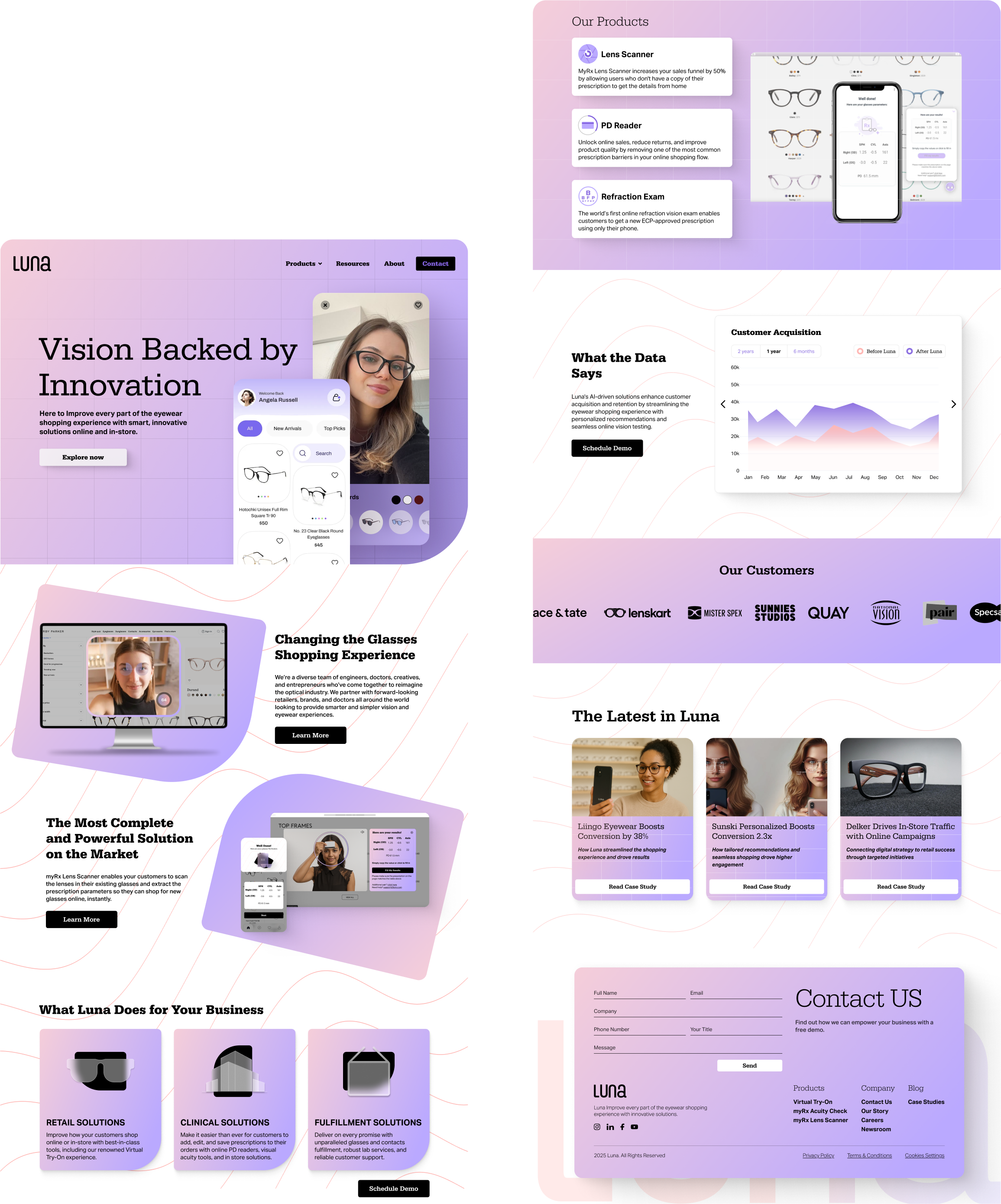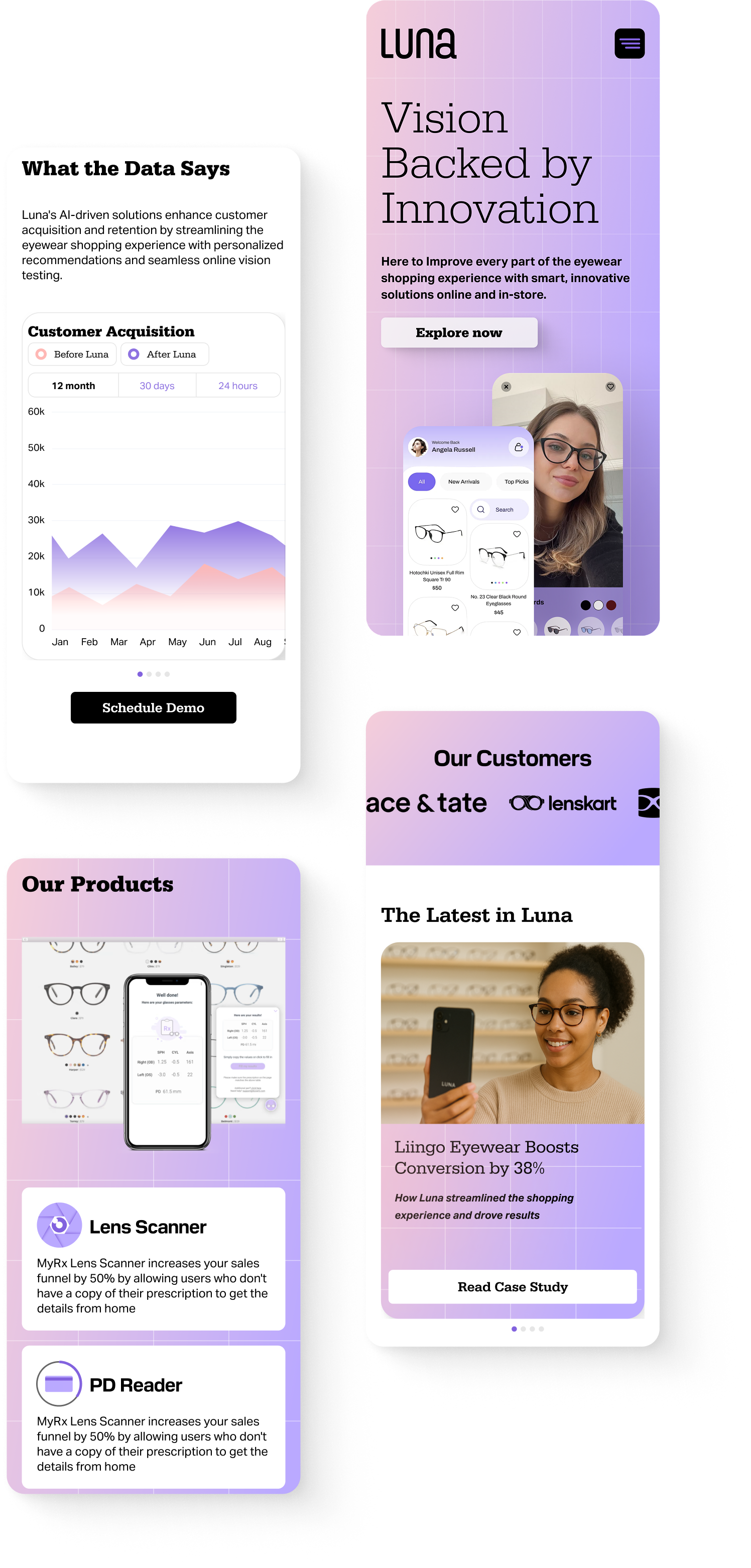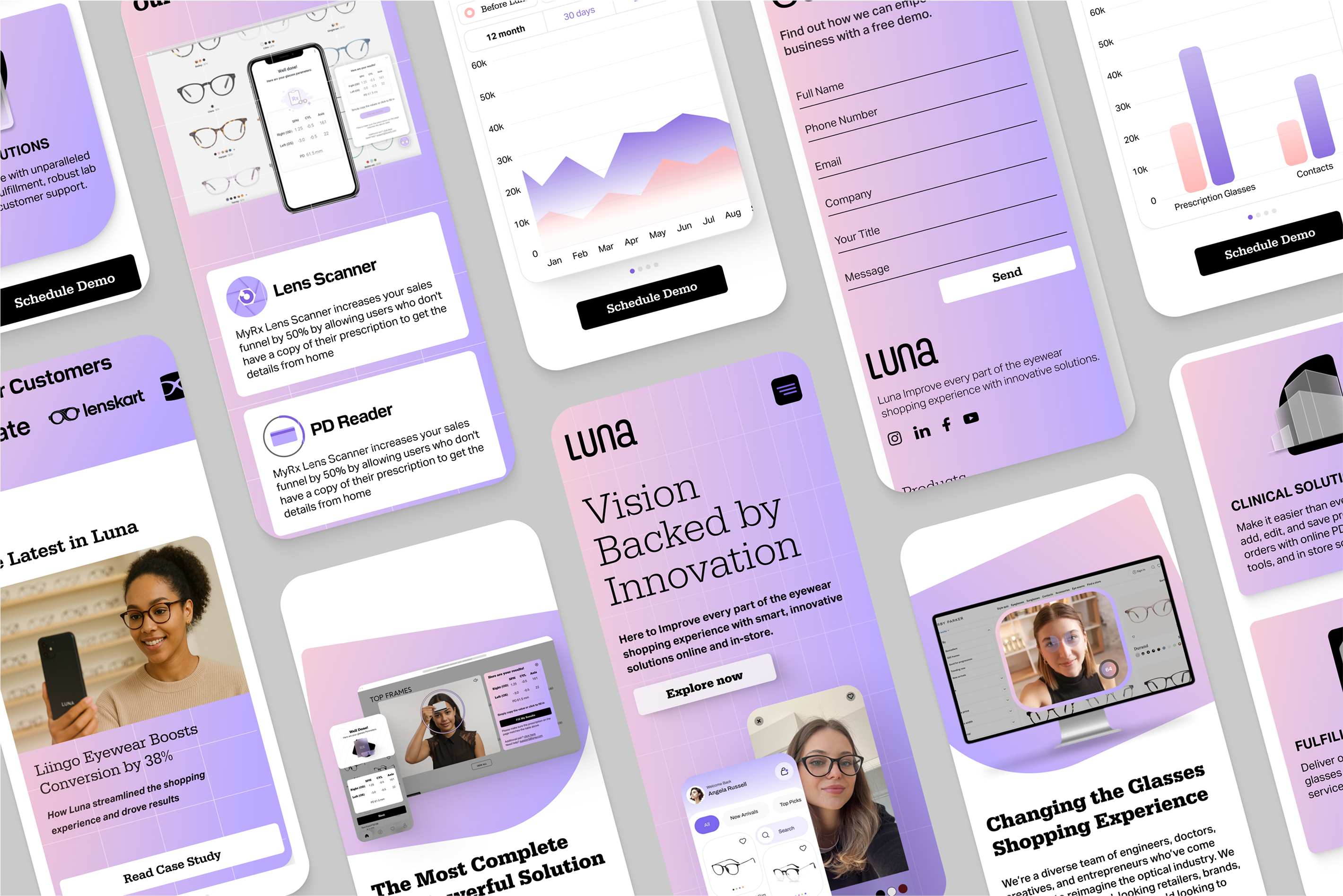
Where the Brand Stands and Where It Could Go
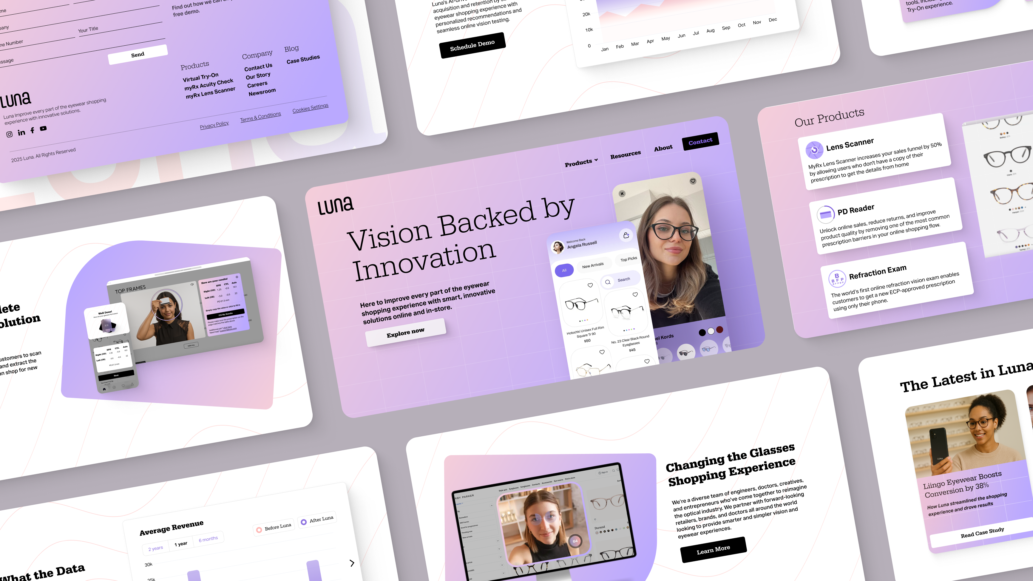
Reviewing Luna’s website revealed missed opportunities to engage users and communicate the platform’s full potential. The brand felt static and underpowered, lacking the interactive elements and content necessary to inspire confidence. To solve this, I pushed toward a more modern and refined direction that highlights Luna’s advanced features while creating a more inviting and intuitive user experience.