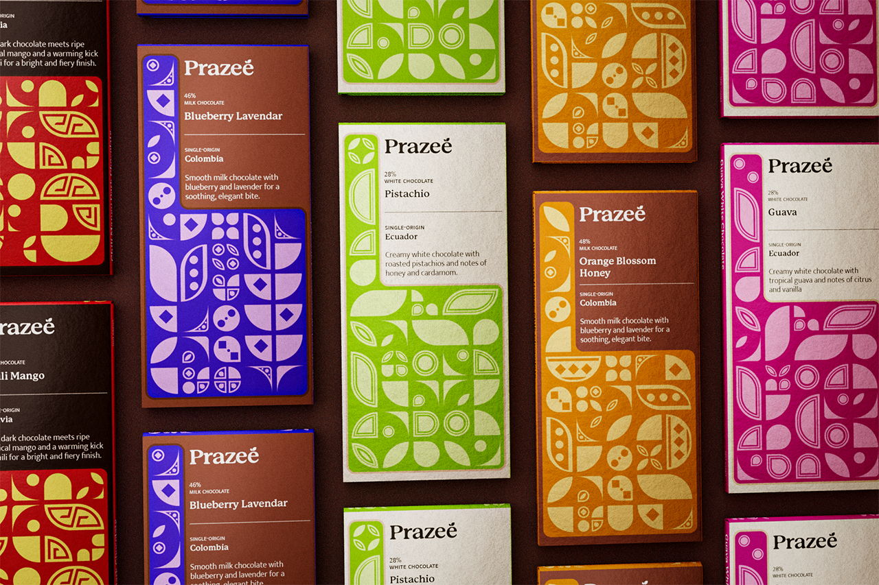
06

Soluna

Food & Beverage

Agriculture

Class

Portfolio I

Duration

4 weeks

Typefaces

P22 Mackinac Pro, New Zen, IvyEpic

Deliverables

Packaging, Brand

Problem

Most well-known chocolate brands rely on safe, corporate aesthetics that feel disconnected from chocolate’s deep Latin American roots. This visual homogeneity flattens the rich cultural history of cacao, reducing it to minimalism or nostalgic heritage motifs that don’t reflect its origin or story.
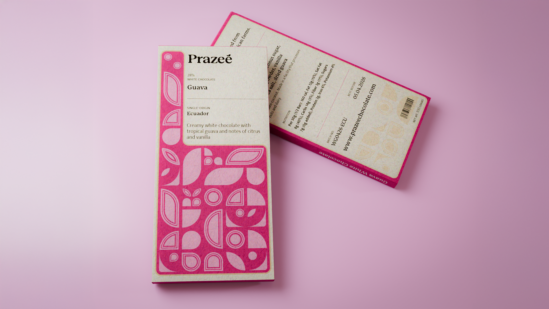
Solution

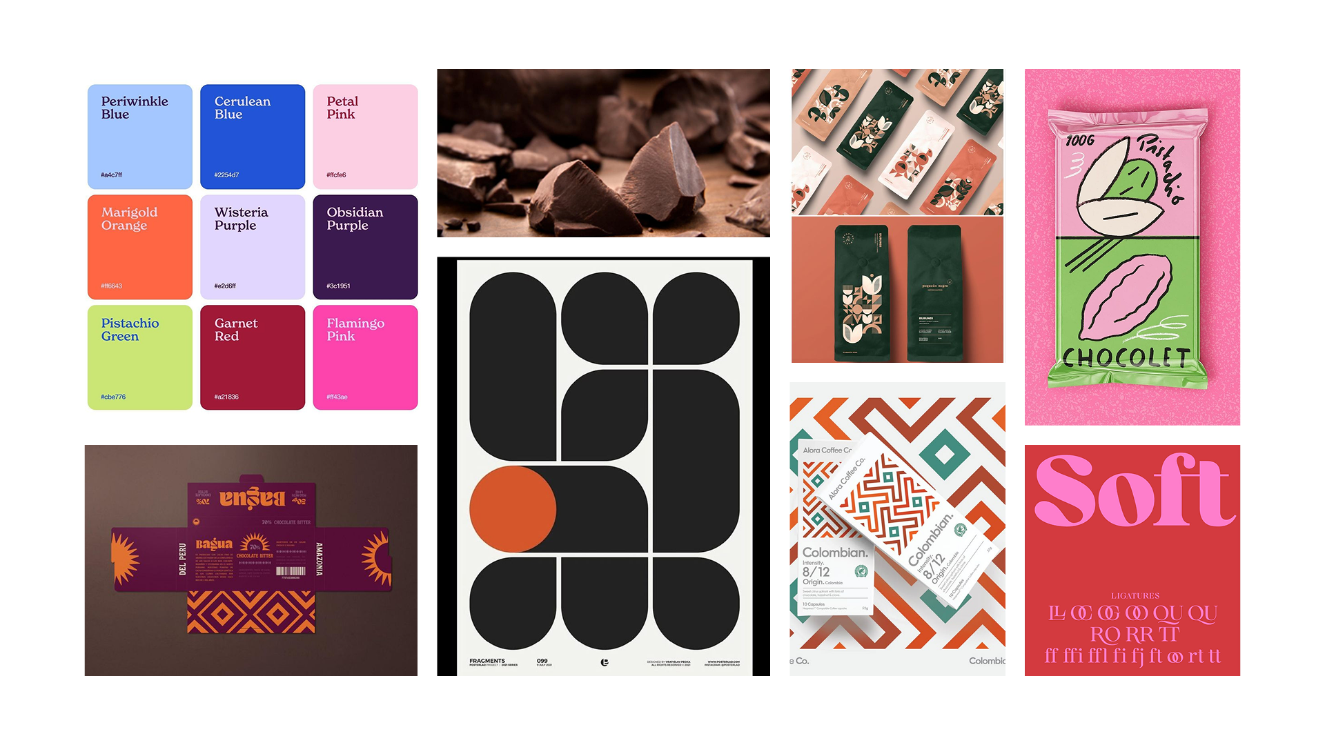
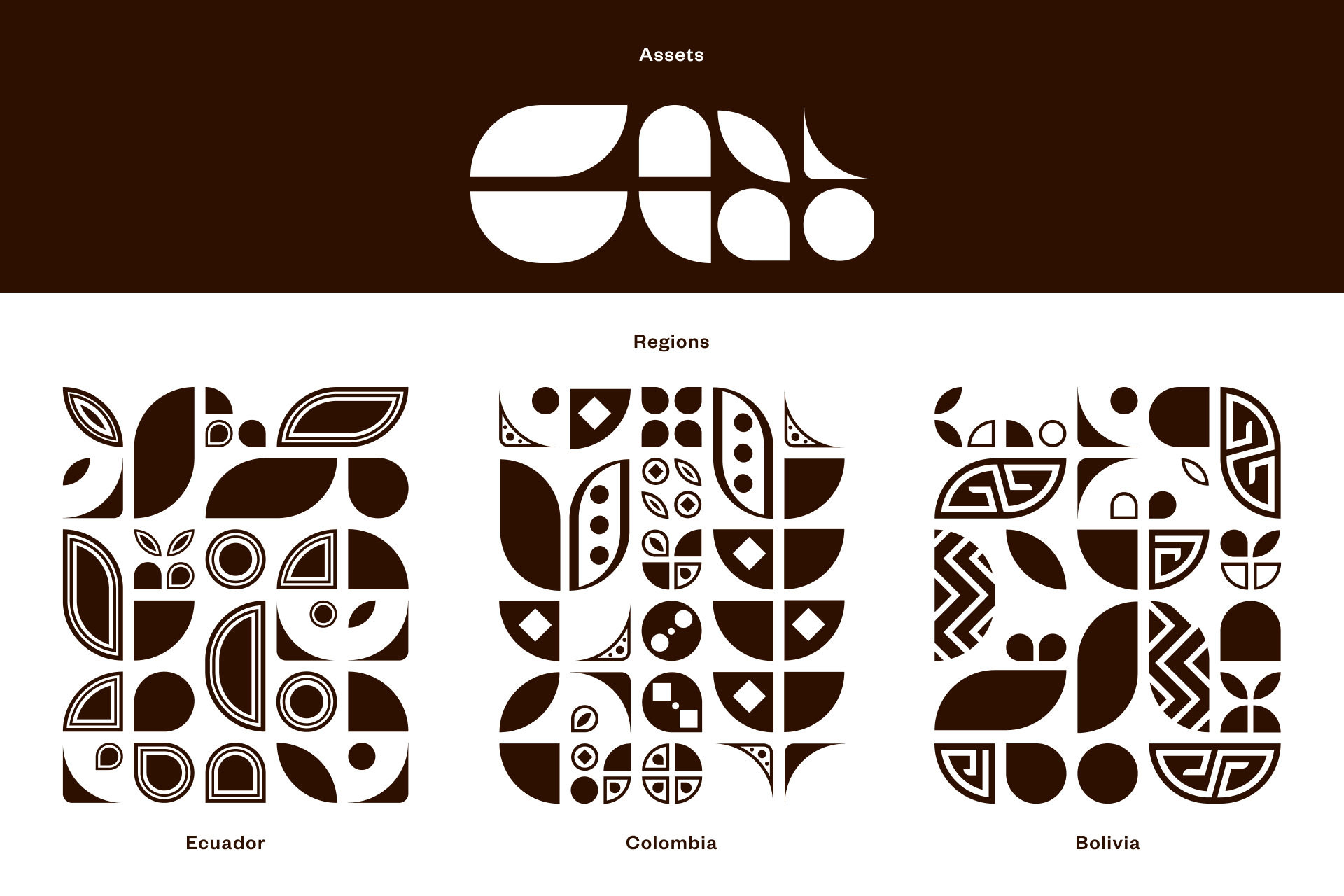
This brand reclaims that narrative through a bold design system that merges Bauhaus-inspired structure with the vibrant spirit of Latin culture. A grid-based layout brings clarity and order, while expressive color pairings and geometric patterns celebrate the origins of cacao. The result is a modern, ethical chocolate identity that feels both culturally grounded and visually distinctive.

Initial Planning

My initial sketches explored bold yet refined directions that aligned with the brand’s premium feel. Inspired by the vibrant colors and patterns of Latin design. This exploration eventually lead to the integration of bauhaus design as a way to stand out from other latin styles.

Using Patterns as a System

Each Bauhaus pattern integrates distinctive shapes or motifs that serve as visual markers for the chocolate’s country of origin, blending graphic identity with cultural storytelling. These visual cues create a system that’s both expressive and informative, reinforcing the brand’s commitment to transparency and design with intention.

Brand Identity

Each bar uses a distinct color system where the base represents the flavor and chocolate type, while a contrasting accent ensures the pattern remains bold and visible. A structured grid layout keeps information minimal and clear, balancing the vibrant visuals with a premium feel. Country of origin is placed boldly to reenforce the idea of transparency.

More Projects